
Copper + Sage Watercolor Invitations for The Big Fake Wedding
Watching this suite form itself and come together was restorative and reviving for me, like meeting a new friend and then getting to know her. These days I can’t help but feel like instead of deciding on my artistic style I’m uncovering it, bit by bit.
When The Big Fake Wedding reached out to me and asked me to participate in the October 2018 event in Austin, I was so honored… and so exhausted. With a fairly full client load and a nine month old who wasn’t sleeping through the night, to say that I was running on empty is putting it lightly. But, looking forward to working with new vendors here in Austin and stretching myself creatively, I readily accepted the invitation. Afton sent me the glorious autumn color palette of rusts, copper, terracotta, and eucalyptus, and suddenly it became all I thought about. I could see these bewitching fall colors swirling against my eyelids at night. A fog lifted a little bit.


A little at a time, I began by getting to know the colors and observing how they interacted. I happily pushed water and pigment into little puddles and got more and more excited as I played!
I planned to just use those early paintings as practice and inspiration, but I got a little attached (as I’m want to do) and made the decision to add some interesting lines by implementing them into my A7 envelope liners.

As with any of the invitation suites I create, every piece began the old-fashioned way: on paper, with my two hands. Every letter was calligraphed or carefully lettered by me. I let all the watercolor take shape under my brush. I fully believe that a suite that’s absolutely handmade is a really special thing. It feels weighty and important in your hands.

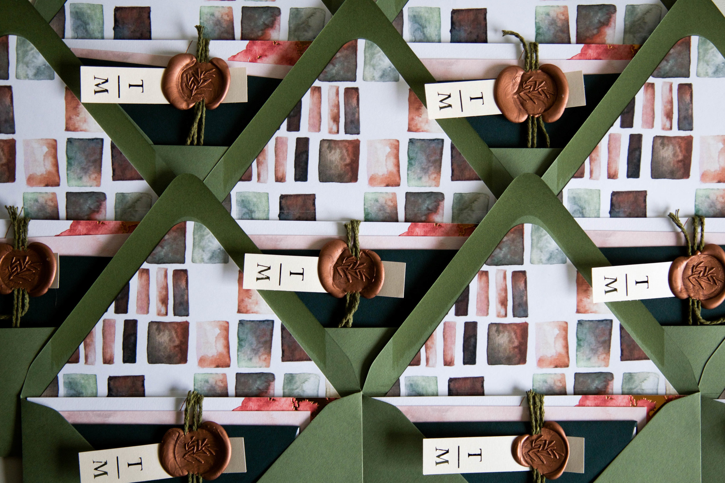
I’ve been falling in love with really interesting packaging lately, so I cut these pretty little tags with Tiffany and Mark’s initials in house to add another layer of texture and detail, making each envelope feel like a really special present, just begging to be unwrapped.
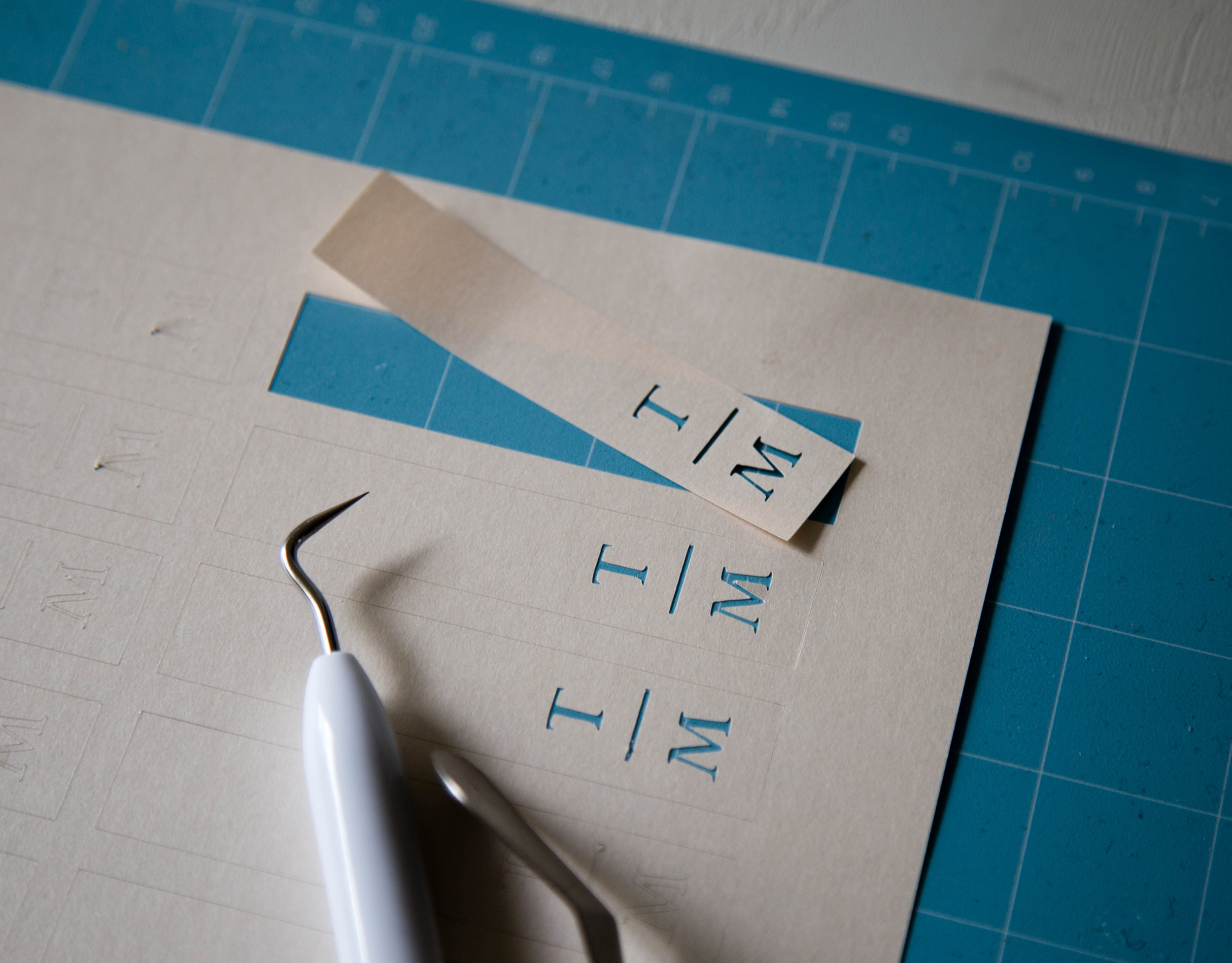
Initial tags were attached by cotton string and a lovely copper wax seal (this one is the Sage Sprig from Stamptitude) and peek out ever so slightly once the envelope is opened up.
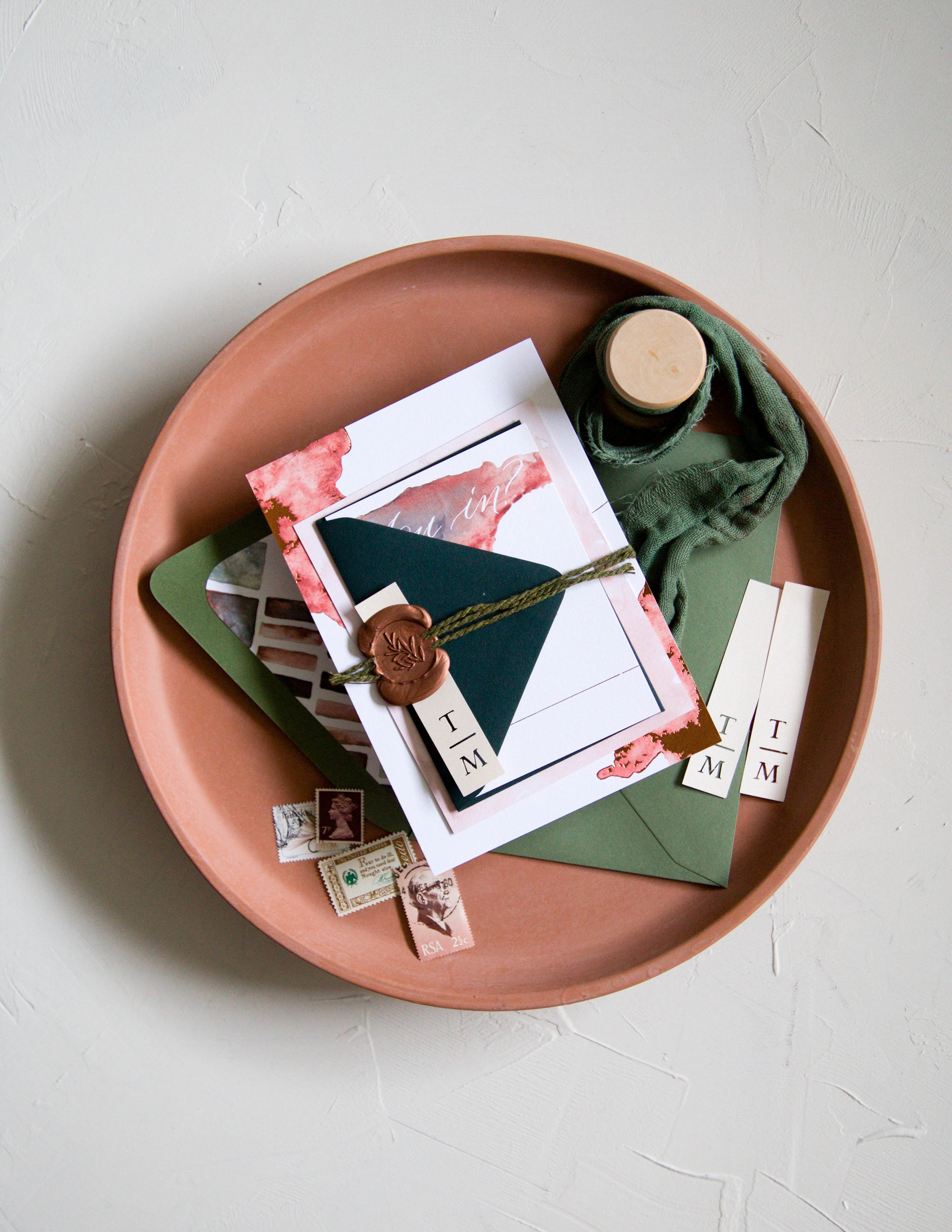

I chose copper foil stamping on the main invitation card to add a little glimmer - this is the most important piece, after all!

The back of the details card features an illustration of The Addison Grove, drawn with my trusty Nikko G nib. The original illustration measured about 8x10 to allow for a decent amount of detail. Modern, clean lines meet hill country charm at this warm and inviting barn venue, making it one of my favorites in Austin.


It was truly a pleasure to be a part of the Big Fake Wedding. I got to work with so many talented and knowledgeable vendors at the event, but a few of my favorites were The Farmer and I for floral design, Iced Cakes and Confections for the most magical and tasty treats, XO Moreau for planning and design, and let me tell you…. you need The Pictures to play at your next event. I’m serious.
After crafting each element by hand and spending so much time adjusting each piece until it felt right, I have so much affection and warmth for this suite. With each letter formed and each seal stamped, I felt myself fill back up again.
We all feel our creative flame dim occasionally, maybe even to a faint smolder. After a long summer of busy-ness and new motherhood, mine was just a smoking wick. This copper and sage suite was the gentle bellows I needed to stoke that fire, just in time for Autumn.